This is something I run into a lot in the engineering/GIS world - a misunderstanding of contour data.
Often, if you ask for a topographic dataset, you’re handed contours. They’re easy to understand and they look nice on a map.
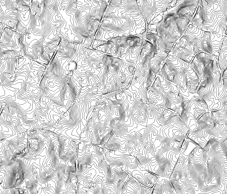
The problem: many engineers forget that contours are one or more steps removed from the original topographic data. Somebody surveyed a bunch of points and fed the points into a GIS/CAD program to draw those those pretty lines. Contours are generated by interpolating between actual data points. They’re merely a visualization tool - they’re not the same or better than the original data.
This is really problematic when it comes to LiDAR. If you paid for high-resolution LiDAR, there’s no sense in sharing the data as a set of 2-ft contours. That’s like taking a picture with a nice digital camera and distributing wallet-size photocopies instead of the original file, or watching a Blu-ray movie on an old CRT television. Sure, those 2-ft contours are handy, but they’re less accurate - especially in flat areas, steep areas, along roads, and in stream valleys. Basically, places where accuracy is really important. Between elevation 124 and elevation 126 you could be missing a lot of variation.
Save the contours for your maps. Build a DEM from the raw data for actual analysis.